
Hasbean of the UK was the big winner, but there were countless worthy entries in this year’s World of Coffee Design Awards competition.
BY CAROLINE CORMIER
SPECIAL TO BARISTA MAGAZINE
The effortlessly curated corner of World of Coffee dedicated to the Design Awards has been celebrating the most impressive coffee packaging designs for eight consecutive years.
Design Considerations
Entries for the 2022 awards were judged according to the following criteria:
• Individuality: How distinctive is the design? Is it fresh, original, unique? Have you seen it before in coffee?
• Sustainability: Were materials or systems designed with sustainability in mind?
• Innovation: Does the submission outline any new systems, technology, or approach that has value? What problems are fixed?
• Overall: This section carries double the points, addressing overall appeal and functionality as assessed subjectively by each judge.
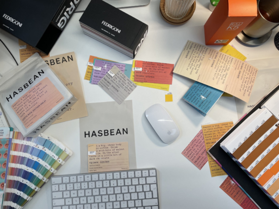
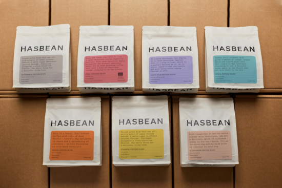
With dozens of worthy submissions, the winner of the 2022 competition was Hasbean. Hailing from Staffordshire, United Kingdom, Hasbean—which is part of Ozone Coffee Roasters—launched its fresh new look at the London Coffee Festival earlier this year.
Hasbean Rebrand Wins
Hasbean’s rebranding—the product of a six-month creative process led by in-house designers Ed Hughes and Fran Newman-Day with the help of Oliver Tyrrell Studio—is absolute perfection. Having been in the coffee business for over two decades, the Hasbean team has always taken great pride in making incredible coffee accessible. With their new design, they achieve exactly that.
The Pantone-inspired palette instantly draws in anyone on the hunt for their next great cup of coffee and makes it easier to quickly spot your favorites. With Garton font as the focal point and cool colors as the backdrop, Hasbean’s new look makes for the perfect eye candy. However, it’s the delicious coffee inside and pithy and down-to-earth descriptions of it that will keep customers coming back for more. With a “little nudge of grapefruit,“ “the fresh zing of lemon,“ or “big, rolling caramel,“ how can you resist craving a taste? Syrupy, squishy, gloopy, melty—these clever descriptors bring Hasbean’s specialty coffee offerings to life and make their excellent coffee even more accessible than before.
Other Standout Designs
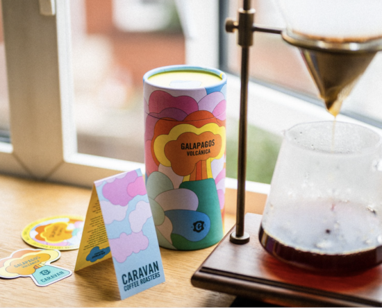
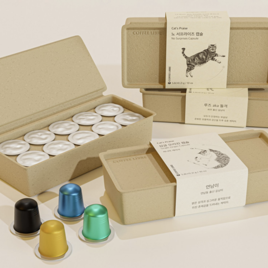
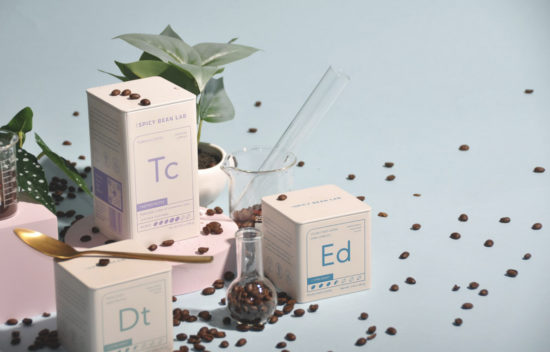
It was an impressive win for Hasbean considering the high level of excellence of the other 29 entries, which included Coffee Libre of Seoul, South Korea’s simple, elegant coffee capsules; L.A.-based Spicy Bean Lab’s tin cans meant to have their periodical table inspired designs displayed in the home; and Caravan Coffee’s colorful canisters that are used exclusively for coffee from the Galapagos Islands. “Beyond our typical associations with the archipelago, which tend to look backwards at its past, we wanted to portray the islands as they are—alive, colorful and full of life!“ wrote the London-based Caravan in its entry. “For this design we take our customers on a journey to the volcano of Santa Cruz, surrounded by the trade winds which provide the island with its cool climate, making specialty coffee possible even at the unbelievably low altitude of 100 meters above sea level. Clashing colors and large typography, inspired by Ecuadorian art as well as ’60s and ’70s airline travel posters, are matched with layered illustrations of the different flora and wildlife to create a range of assets for the packaging and marketing of this special coffee.“
For their part, Hasbean—which has long been known for its bright-red brand identity—made a bold move by completely reimagining the company’s look and vibe. “At the start of this brand revisitation process, we knew that after 20 years of the same look, it was long overdue for us to take this opportunity to get back to the essence of what Hasbean stands for: making incredible coffee accessible. That view was woven into each part of the new brand and bag designs,“ the company writes in their entry statement. “The world of speciality coffee has evolved, and we’ve always considered Hasbean to be on the forefront of its evolution in terms of the range and variety of flavors, origins, and processes we offer. It was time for our new brand, and subsequent packaging designs, to reflect that evolution. We took inspiration from our own community: hearing directly from them, as we always have, what was most important to them when selecting their coffee, and how we could make the entire process a bit more enjoyable, and simpler.“
Interested in seeing all of the entries in the World of Coffee 2022 Design Awards? Follow this link to view images, artist statements, and more.
ABOUT THE AUTHOR
Caroline Cormier (she/her) is a freelance writer from Toronto, Canada. She currently lives in Berlin, Germany, where she’s been supporting local efforts to help Ukrainians who have fled to the German capital. You can follow her on Instagram at @ccormier_.